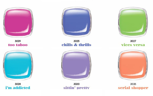
 Yay nail talk!! So now is the time where nail collections start getting gorgeous. They start launching their summer colors which always are bright colors which are my favorite. +Essie Cosmetics, Ltd. launched their Summer Neon 2014 collection. There is a total of 6 colors and they are all amazing when you see them in the ad. Too Taboo is a vibrant neon pink which looks just amazing. Chills & Thrills is a muted vibrant blue which has a bit of a purple tone to it but still nice. Vices Versa which is one of my favorite ones is a nice neon green. Its the green that you just want to wear all summer long. The money maker color for this collection is definitely I'm Addicted! I don't know what is is about these types of blue. Its like a turquoise baby blue which is what summer should look like. My favorite color in general is pink but for some reason turquoise and blues always call out to me. They are just too amazing for words so naturally I would gravitate towards this color. The next is Sittin Pretty which is a purple that kind of looks like Play Date. Finally the peach is another summer-y color is called Serial Shopper. Again this peach color is something I feel has been done before. Haute as Hello is something that looks just like this, its a peach that has more if an orange color to it.
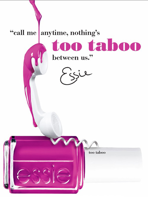
I was very excited for this collection. It was something that I just thought I'd buy the whole collection in one shot because I needed them. I went to Duane Reade the other morning and while looking for something else, I came across the display for this collection. It had looked like they had just put them out. To my surprise, I was very very very disappointed on how they looked. The pink wasn't as vibrant as it looks like in the pictures. Its more of a dupe for Splash of Grenadine, so I would say if you have that one, this is not really needed. The blue one is okay in pictures but in person it's even more bland. Nothing I would want to wear in the summer. Its more of a muted color. The purple is definitely something I've seen before like Play Date. I think Play Date is even brighter than this so-called Neon which is why I am so disappointed. The only colors that are even worth looking at is the I'm Addicted and Vices Versa which again, I believe I've seen these before. The I'm Addicted is gorgeous, I think it's prettier in person that it is in the picture but still its something that is definitely dupe-able.
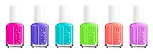
The colors in the picture to the right is suppose to be this collection as well but if you look at this swatch and the above swatch with the names, the colors look really different. Unfortunately, in person they don't look anything like those and they are even more muted than that. To me, they would be a good color to choose if you are going to get your nails done but honestly, I am not rushing to purchase the whole collection as I originally thought which is sad because I had really high hopes for this collections.
Let me know if you bought these and if you have better experience that I did with them. Tag me on Instagram or you can post them on my Facebook page.
No comments:
Post a Comment